How to Achieve Clean Web Design
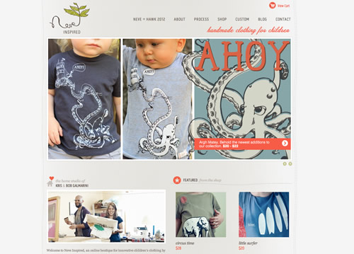
Complex and confusing websites are an instant turnoff. They’re unwelcoming, frustrating and lead you around in circles before you find what you are looking for. People look for simplicity and clarity in everything around them and this is applicable in the case of Web designs too. An aesthetic design lends sophistication to your site, adds credibility to the content, helps in attracting visitors and retains them for longer. Seek memphis web design services to help you develop a well-designed website for your business.
Here are 6 simple steps to achieve a clean Web design:
1. Declutter Your Site
Decide on the elements that you can do away with, to make space for the essentials. Every element on a webpage and every webpage on a site should have a purpose to serve. Unnecessary elements like blinking banners, scrolling text and irrelevant ads are an eyesore and need to be eliminated. The content on your site should also be refined to present details in the best way possible.
2. Keep the Big Picture in Mind
Be as innovative as you can, but it isn’t always necessary to reinvent the wheel. Usability is ultimately the most important thing and users should be ensured of smooth surfing on your site. Navigation should be as intuitive as connecting dots, to help your site reach users and accomplish the purpose for which it was created.
3. Have a Solid Layout

Design a layout that complements the content, facilitates readability of text and has a flexible structure. A solid grid layout acts as a base on which the site can be constructed. A carefully-planned layout provides order, hierarchy and uniformity to your webpages and presents all the design elements in a neat and organized manner.
4. Enhance Readability

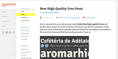
Readable and scannable webpages can be created by good typography and a wise choice of colors. The fonts you use on your site should be consistent throughout, blend with each other, be legible and ensure a seamless flow of content. Stick to a limited color palette with the right contrast to give your site that touch of class and professionalism.
5. Space it Out

White space allows the design elements on a webpage to breathe and makes the webpage content easily scannable. When used correctly, it acts as a tool to emphasize important text and images. It allows design elements to be visually separated without the usage of boxes or lines. Leading, which is the space between lines of text, is another vital aspect of Web design that helps readers scan through content in a smooth manner.
6. Use Consistent Images and Attractive Graphics
Opt for images and graphics which have a strong visual impact. They should be consistent throughout the site and in sync with the information presented on the site. It would also be ideal to use similar color schemes and geometrical frameworks for all charts, infographics and other illustrations you use, so that these elements are in line with the overall theme of your site.
Creating a clean Web design isn’t a Herculean task but it requires a lot of patience, practice and the willingness to experiment. Remove, add, tweak and refine till you just can’t do anymore. Make sure that every element on your site is just where you want it to be and presented in a manner that is more than satisfactory. Though a lot of time goes into perfecting every little detail, your efforts will ultimately pay off helping your site reach the zenith of success.


