Designing a modern colorful brochure cover photoshop tutorial
While there is the emphasis of being minimalist in modern print design, to fully create an impressive looking brochure cover these days, you need to pay attention to key subtle details. It is not just about the colors or your overall color scheme. It is about adding gradients appropriately, glow and shine effects that is reminiscent of digital web designs.
In this tutorial, we will show you how you can design a modern brochure cover that is simple, colorful, but fully impressive and trendy, matching the latest successful designs both in print and in web layouts. So carefully read the items below and start learning how you can design your own modern and colorful brochure cover.
Need to print your stickers try Sticker Printing Services
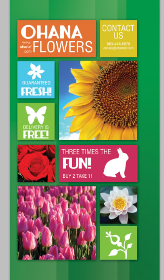
Final image
Step 1
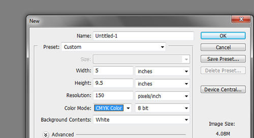
First we start with our document. Since this is just the cover, we will have the full height of the brochure, but just 1/3 of the width. Also, since this design is meant to be pasted to a full scale brochure template, the resolution is still at a high value. Here is the list of the best document setting values to use.
- Height: 5 inches
- Width: 9.5 inches
- Resolution: 300ppi
- Color Mode: CMYK
Step 2
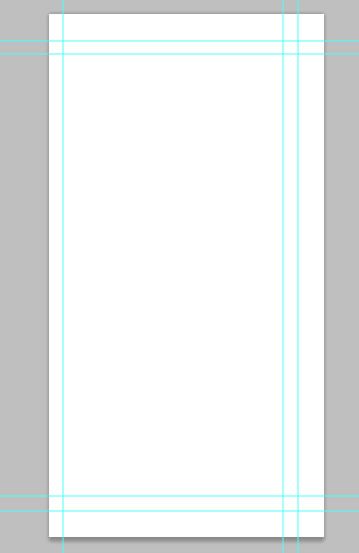
Next, we setup our guidelines. To do this, make sure that you have your rulers out. If not, press CTRL+R to make them visible. Now set a margin 0.5 inches on the top, bottom and right sides. We will not set up a bleed margin on the left side as this is the area that connects to the other part of the brochure. Once done, count a 0.25 inch security line from your margin lines (top, bottom right) as well as from the edge of the left side. This is the security line which should make you remember where design elements are better not placed. In the end, your sample document should be something like this:
Step 3
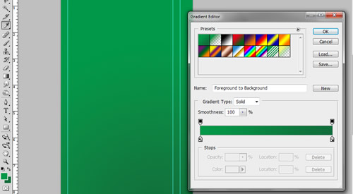
First, we setup the background. While plain white is okay, today, it is best to use more dynamic gradient colors. So using the gradient tool we paint up a gradient color to the background. Here we used a green to light green gradient that goes from the bottom right of the cover design. Just choose the color scheme appropriate for your own brochure.
Step 4
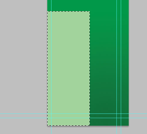
Create a new layer by pressing CTRL+SHIFT+N. Then, use the rectangle marquee tool to inscribe a tall rectangle shape. Fill the selection with a light green color.
Step 5
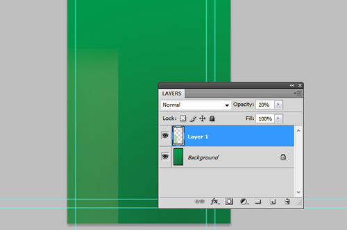
Then, change the opacity of this layer to 20%. Afterwards, use a round and soft eraser brush tool to remove the hard edges at the top and left of the graphic.
Step 6
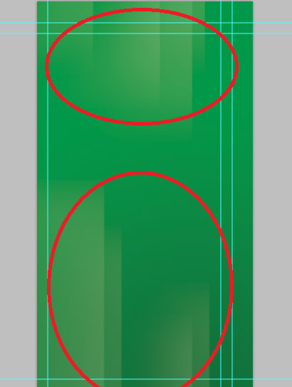
Duplicate this reduced opacity layer and vary its position from the original. Once done, you may want to make more duplicates and place them all over your design like so.
Step 7
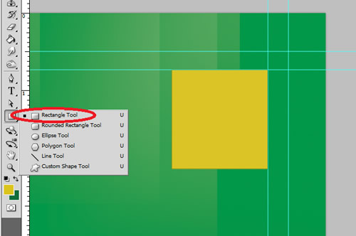
Now, for our modern design, we will use color boxes for the content. We will use the rectangle shape tool to do this. So go select the rectangle shape tool and create a small rectangle. Choose a nice color for it that matches your theme.
Step 8
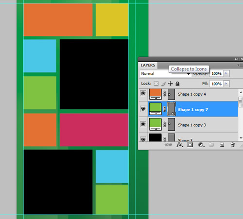
Now, just continue with creating rectangles of different sizes. Use a different theme color of your choice. Also, reserve large rectangle spaces for your main brochure images. In this example, we placed two large black rectangles for the images, and the rest are variations of smaller rectangles and squares.
Step 9
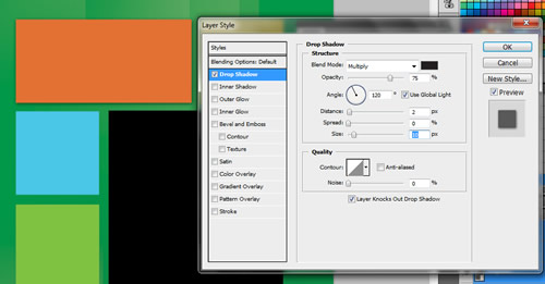
Next, double click on one of the rectangles, to get to its layer style options. Click on the drop shadow option and use a 2px distance value with a size of 10.
Step 10
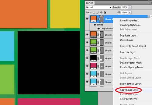
Once done, right click on the layer and select the option to “copy layer style”.
Step 11
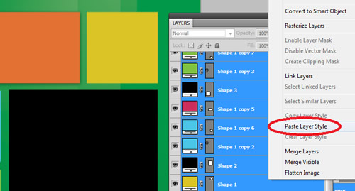
Then, select all the other rectangle shapes and then right click on them. Choose the “Paste layer style” option to apply the shadow to all your boxes.
Step 12
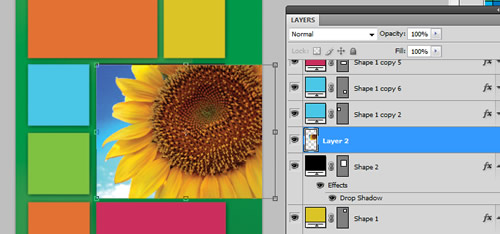
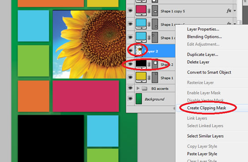
Great! Now let us add some pictures. First we paste in one of our main images. Place it on top of the shape where you want it to be placed. Remember that you can press CTRL+T to scale and resize images as needed.
Step 13
Once done, right click on your image and look for the option to “Create Clipping Mask”. This should clip your images within the bounds as determined by the layer below.
Step 14
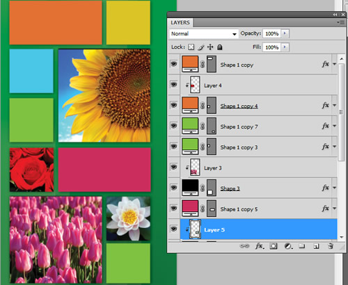
Then, just repeat the process several times for all the images that you want inserted into our design.
Step 15
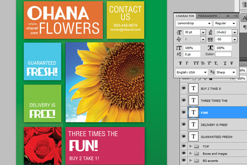
Now, we type in our text. Add them to our color boxes of course. It is best to use white text here to contrast with the color. Use varying font styles as needed. Also do not forget that you can use the character panel to edit the spacing of your text.
Step 16
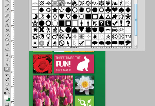
Now we add some icons. Using the custom shape tool, we choose the appropriate icon shapes for the different color boxes. This should help people identify and remember the marketing slogans better.

Step 17
Great! That finishes our modern and colorful brochure cover!
