Create your Own Propaganda Inspired Gig Poster – Photoshop tutorial
This photoshop tutorial is on how to design a gig poster with a propaganda theme. I’m sure you’ve seen this technique somewhere and have wondered how it’s done. These posters are actually fairly common, combining a mix of grunge, abstract style and a little bit of outside the box creativity to achieve a great looking poster worthy of print.
STEP 1
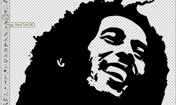
First, you will want to prepare your main feature image for the poster. Of course, this can be a picture of you, your band or any image you choose depending on your theme. In this example, we will use a nice processed image of a very inspirational artist who is revolutionary in his own right. Feel free to use a stronger character though like Mao Tse Tung if you wish to toughen up your poster more. We prepare the image by using the Magic Wand tool, erasing his background and basically creating his own layer for easy cut and paste later.
STEP 2
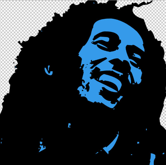
For the insides of the graphic, which is the face and some other lighter elements though, we put in a color. You do this by just using the paint bucket tool on the precise areas you need whilst the white parts are still selected. Keep this document open for now.
STEP 3
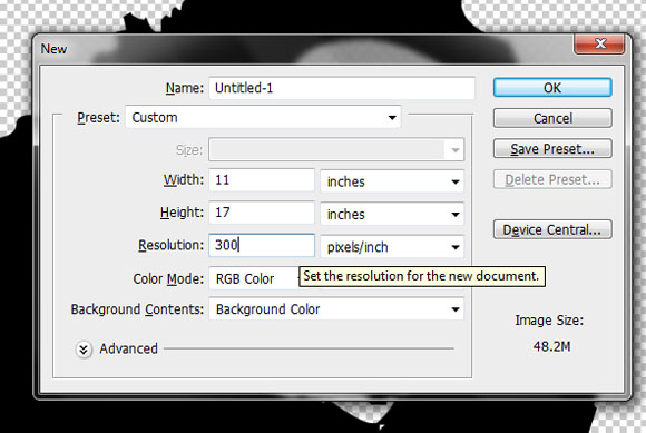
Next, setup your new document. You will want to use standard poster dimensions so for this tutorial, we’ll be going with an 11×17 poster. If you wish to apply this technique for printing flyers or catalogs, make sure you start off with the right print size so as not to resize everything at the end of the tutorial and end up with undesirable proportions on your design. For the resolution, do not forget to use a 300ppi value to maintain the level of quality that one needs for printing. The higher the value of the resolution the better though.
STEP 4
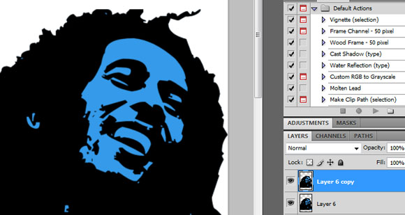
Paste in our image to the new canvass. Position it appropriately as the central feature of our poster. Then, press CTRL+J to create a copy of our image. One will be our backup (just in case we make a mistake) and the other one is what we will be working with.
STEP 5
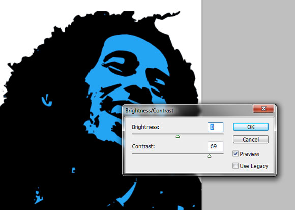
Now, hide the duplicate and we will work on our main image first. Adjust its brightness and contrast a bit to make it brighter and more vivid. Do this by going to Image -> Adjustments -> Brightness/Contrast. The values needed depends upon your image, however for our own image we have used these values.
STEP 6
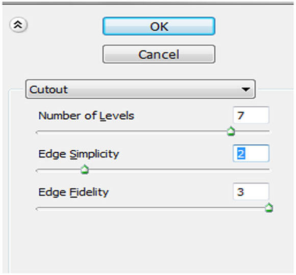
Now, this step is an OPTIONAL step. If your image was based from an actual Photograph, then you will want to do this to make your image look more posterized. However if your image is like what we have now, a processed one, then you do not need to do this step. So if your image is in fact from an actual photograph, go to Filters -> Artistic -> Cutout. Adjust the number of levels to 7, the edge simplicity to 2 and the edge fidelity to 3.
STEP 7
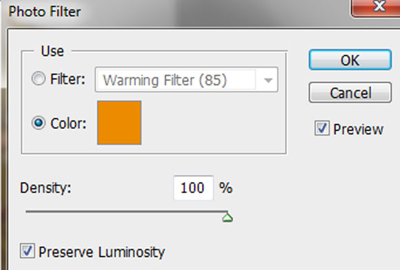
ANOTHER OPTIONAL STEP, if your image is based on a Photograph. Since it will probably have some color. You will want to go to Image -> Adjustments -> Photo filter. Choose a “color” as the photo filter option and set it to your color theme. Set the density of it to 100%.
STEP 8
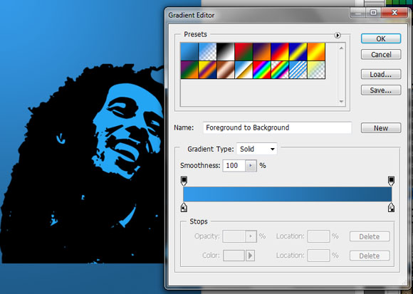
Great! Now we will setup our background. You can hide our main image for now if you want. Create a new layer just above the background layer. Fills this up with your theme colors in a radial gradient. Just use the Gradient tool (click and hold on to the paint bucket tool if you do not see it). Click on the gradient editor and adjust to the colors that you need for your theme.
STEP 9
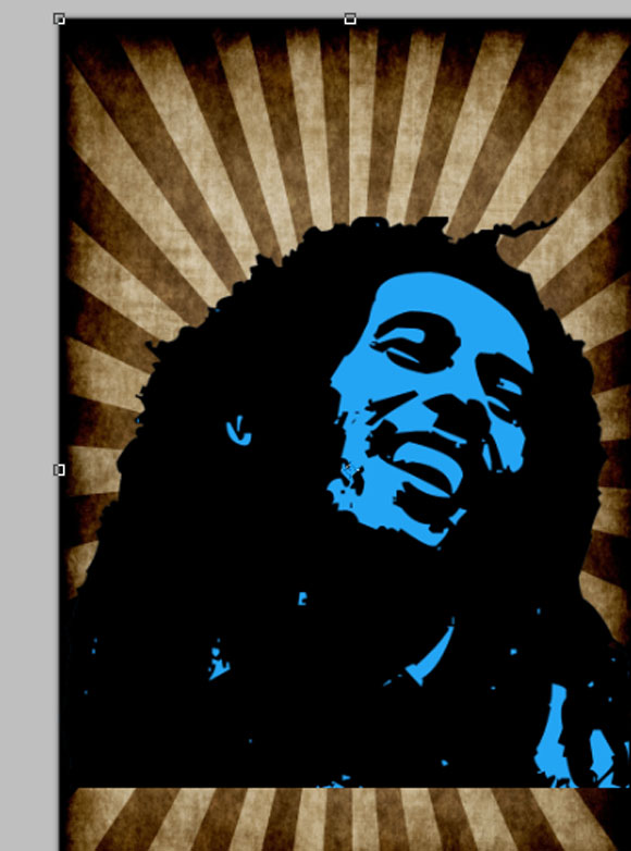
Now, we are going to perform a simple trick. First, we paste in a pre-made grunge background on top of the background color we just created.
STEP 10
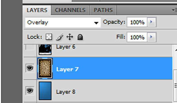
Now, the trouble is, the color does not necessarily match. To correct this, we change the blend mode of this
STEP 11
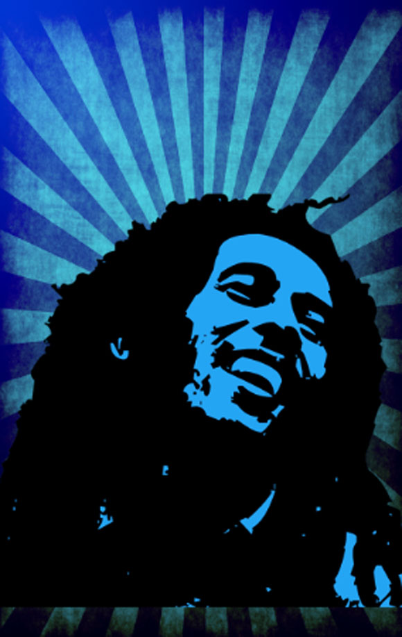
This gives us a quick color themed grunge background for our image.
STEP 12
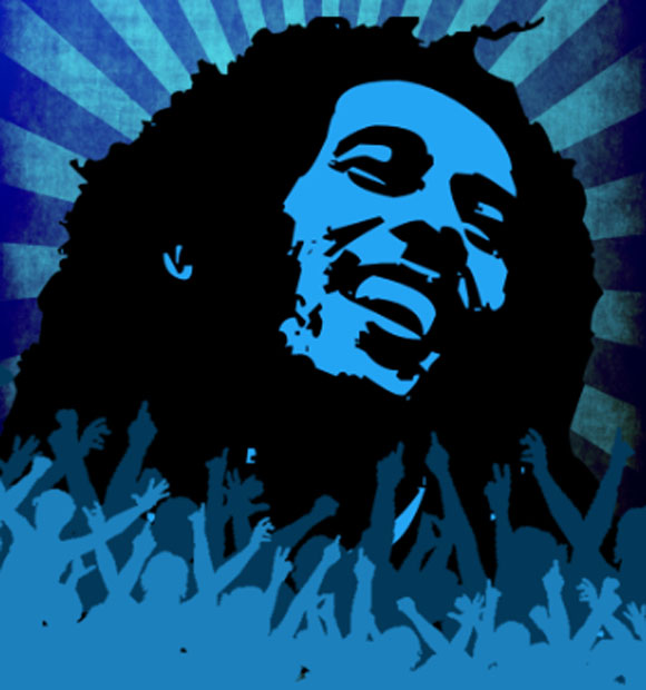
Afterwards, we added a couple of images of a “partying audience” just in front and below our main graphic. We varied the colors according to our theme.
STEP 13
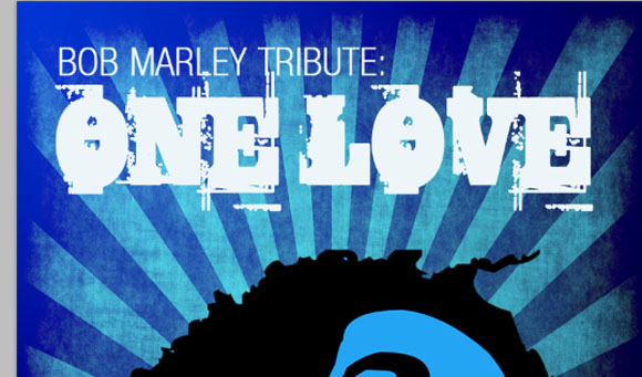
Finally, add your title above. Use a contrasting color for your text.
STEP 14
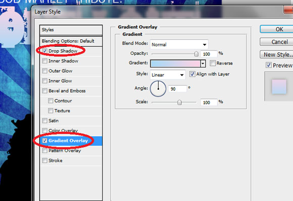
Add a color gradient to our title and sub title. Also play around with adding a reduced opacity shadow. Do this by double clicking on the title layers and accessing the layer styles.
STEP 15
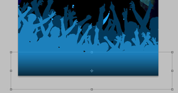
Next, use the rectangle tool to fill out the bottom. Use a gradient color. Use the same color for the top part as the audience image color, and then have the gradient go to a darker hue. This helps make a seamless looking transition like so:
STEP 16
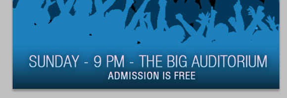
Then, type in our event details below. Use the same layer styles as you did the title here. Do that by just right clicking on the title layer, selecting “copy layer style” and then pasting it on our bottom detail text.
FINAL IMAGE
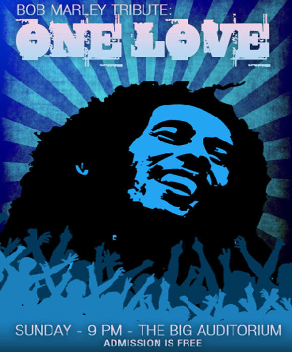
Great! Now you have a great, military/propaganda themed poster with very musical, abstract and grunge elements built in.


