Tips for Designing Great Business Cards
Your business card is your signature, your calling card to the world. You should always have new; updated business cards printed and carry them with you everywhere you go. Each person you meet is a new opportunity to promote yourself, your business or your services. And of course in many cases, your business card design will be the lasting impression people will have of you. Designing a great business card ensures that will be the right impression.
Here are some ideas on how to do that:
1. Color
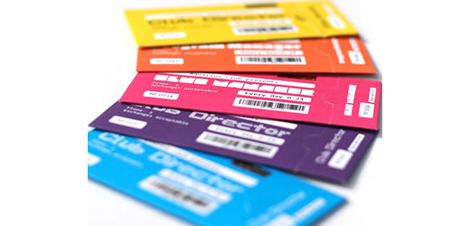
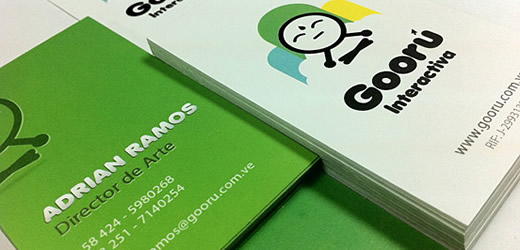
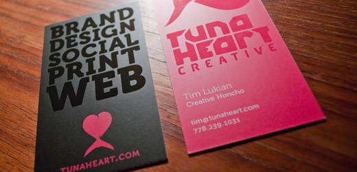
The color of your business cards definitely matters. And your color choice should reflect your brand and what the business is about. In general, there is no “right” or “wrong” colors, only the colors that work best for you. Of course, there are some bad color combinations. For example, giving your card a dark background and using a dark font will make it difficult to read. So remember when making color choices that you want your cards and the words on them to pop. Bright colors are definite eye catchers, and if you can deviate from the standard white background that’s also a plus. Look into color psychology too during your research process to see if you can use color to capitalize on the human response to various colors.
2. Images
The choice of images used on your card will be important as well. Some people choose to put their own face on a business card. That can be highly effective if you are a personal brand or if you work in a profession, like reality, where people will meet you face to face. You could use images that relate to your topic as well such as a lawnmower for a lawn care business. Or if you are a graphic designer, or photographer a business card is the perfect place to show off your skills. Some people choose abstract images and designs which are a bit more interpretive but still striking.
3. Fonts
Font and typography can also make a big difference to the overall effect of your card. While there may be only a few small words on a business card, they can say a whole lot in a tiny space. And in this case, size does matter. Using a too small or hard to read font is going to create a challenge for the reader and they might not bother. The font should also, reflect the general tone of the business. For example, a business person will usually choose a more professional, crisp font where as an entertainer can be more creative. If you do children’s parties or work as a child care provider, you might choose a fun-childlike font.
4. Making Your Card Unique
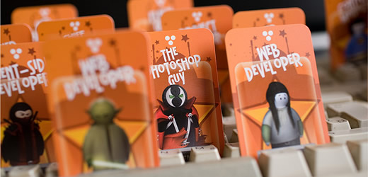
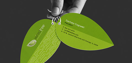
Making your card unique will help people remember you from your card alone. This is a good opportunity to incorporate humor if it applies to you or your business. This is also a chance to really think outside the box in terms of shapes, textures and even die-cutting. It may be the tiny little nuances that make your card distinctive and memorable.
5. Layout and What to Include
There are certain things that should make their way on your business card no matter what design you choose. When it comes to what to include on your card, you should have your name and a contact method at the very least. You might also include a title or company name similar to 벳엔드 주소, phone numbers, email addresses or website URL. The more information and channels of access your card can offer the more useful it will be.
The layout can vary and will depend entirely on what choices you make stylistically. Horizontal layouts are the most popular choice but vertical layouts can work as well. The key is to keep it easy to read it should also, feature most prominently your name and affiliation. Everything else is just icing on the cake. As long as the reader can get your information, you can be flexible and creative in how you present it.

