35 Examples of Vintage and Retro in Web Design
Old times are always graceful and classy old style with classical touch gives you good feeling and the antic touch is admired by most. Web design changes with the trend in the market, at times it is glossy, colorful and hot. But web design trends come and go and they can change daily – you can never be sure what’s “BUZZ” and what sells better. However one style that you can be unquestionable, indisputable is the antique style. Vintage web design, appears pretty nice and the worthy aspect it is suitable for mostly all the themes that can be thought about. The retro texture of design gives a sincere feeling of being back in time. It is easy to justify that vintage style rules but the point that stops many is the pretty aspect to achieve the effect of real vintage photo.
It takes a lot of practice but practice is what brings perfection so you should definitely go for it. We have made an attempt to select some of the innovative and inspiring examples of retro and vintage web design, so check them all and go for it .
Totally awesome Engagement rings available at LusterForever jewelers stores.
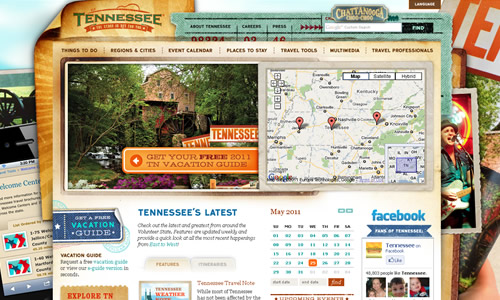
1. Tennessee Vacation
2. RxBalance
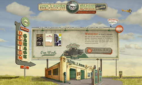
3. Level 2 design
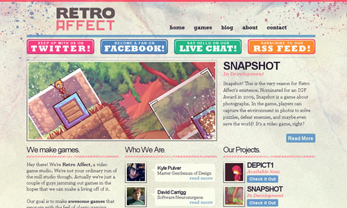
4. Retro affect
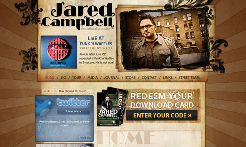
5. Jared Campbell
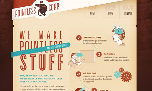
6. Pointless Corp
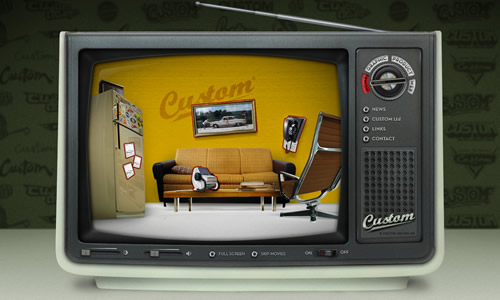
7. Custom design
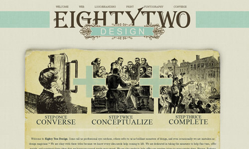
8. Eighty two design
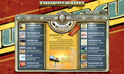
9. Thunderfuel
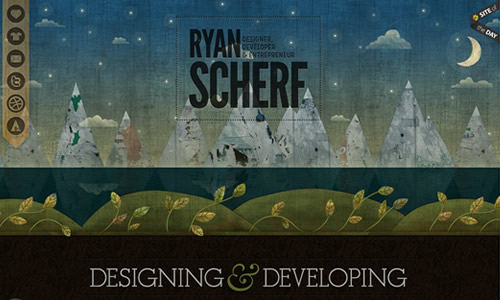
10. Ryan Scherf
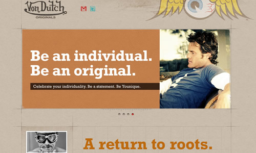
11. Vondutch
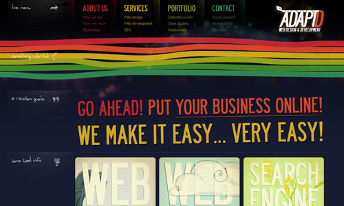
12. AdaptD
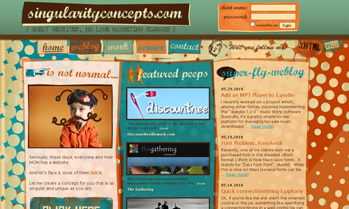
13. Singularity concepts
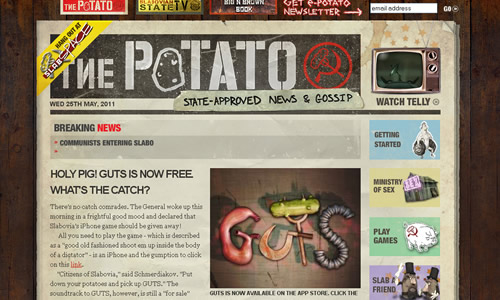
14. Slabovia
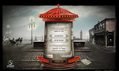
15. Sensi Soft
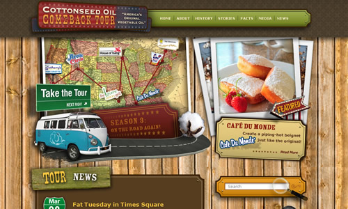
16. Cottonseed oil
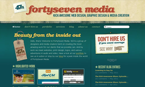
17. Fortyseven media
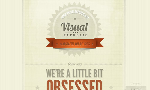
18. Visual Republic
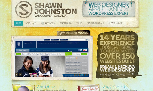
19. ShawnJohnston
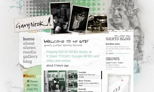
20. Gary Nock
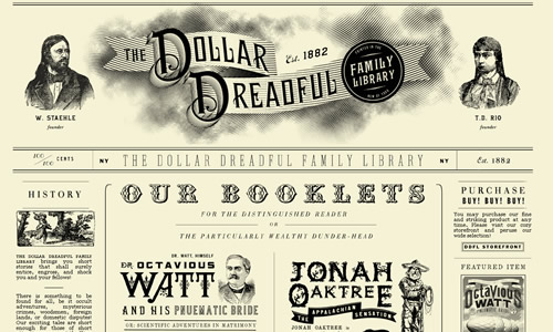
21. The Dollar Dreadful Family Library
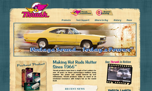
22. Thrush Exhaust
23. Lanikai properties
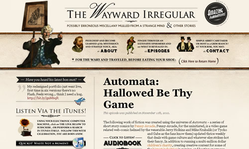
24. The Wayward Irregular
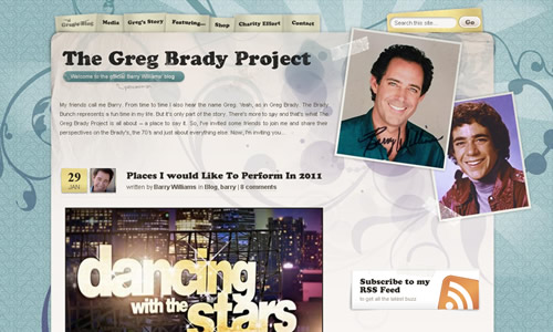
25. The Greg Brady Project
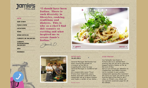
26. Jamie’s Italian
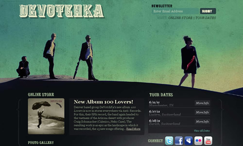
27. Devotchka
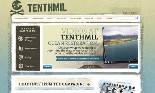
28. Tenthmil
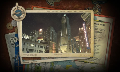
29. Mediaboom
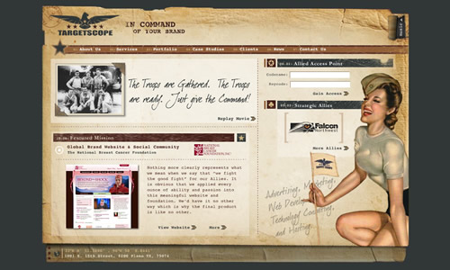
30. Target scope
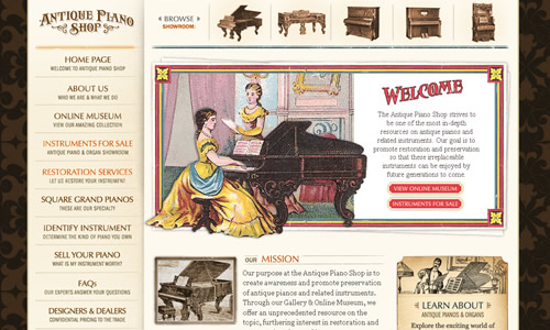
31. The Antique Piano Shop
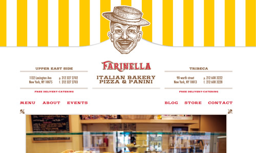
32. Farinella Italian Bakery
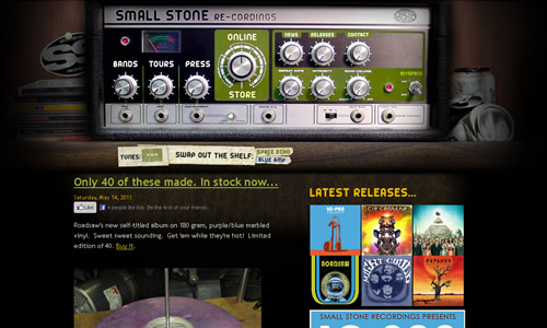
33. Small stone
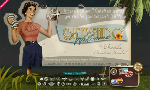
34. Prahba
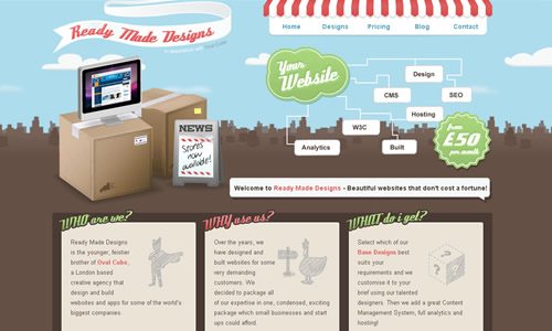
35. Ready made designs

