17 Brand logo evolution
Most of you must have seen these popular logos on advertisement banner, television advertisement or somewhere on magazine ads but have you ever wonder about evolution of these logos. A logo is a graphical symbol or mark which signifies particular enterprises or organizations. Today you will witness how the design of these brand logo evolved from beginning to till date.
1. Apple
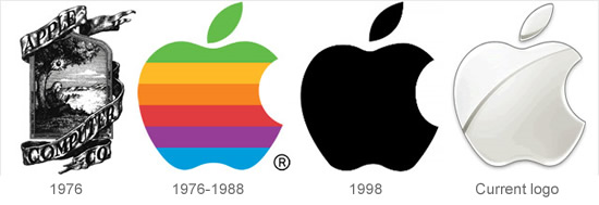
Steve Jobs, Steve Wozniak, and Ronald Wayne together setup a company years back that came as one of the biggest consumer electronics and Software Company, best known for products like Macintosh, iPod and iphone.
Apple stands as an outstanding brand today and to reach to this position Apple had to cross different hurdles, which is a story in itself. Apple started its brand positioning in terms of logo as Isaac Newton sitting under a tree. This had been designed by Jobs and Wayne, with the inscription: “Newton … A Mind Forever Voyaging through Strange Seas of Thought Alone.” Was an excellent idea to use the brand name of Newton and make a way out? But apple couldn’t relate to it for much long. To change the brand and take Apple a way forward Rob Janoff came into the picture of Apple to simplify the logo, which turned out to be a great idea. Rob created the ‘Rainbow Apple’ which was the logo for company till 1998.Apple was already a brand till then and had started relating and wining the heart of the consumer ” With the launch of the new iMac in 1998, they changed their logo to a monochromatic apple logo. When we see the Apple logo, today it comes with nice gradient chrome silver design.
2. Shell
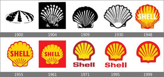
Shell is the global group of energy and petrochemicals companies with their innovative approach they ensure their consumer that they are always ready to help tackle the challenges of the new energy future.
The mission of the Shell directly can be seen in the way they have positioned their band, they believing in adapting to the times .The coloring and lines were adapted to the time changes to keep an image that reflects its era.
3. XEROX
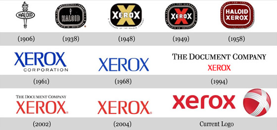
The Xerox Company used to be known as the Haloid Company almost 100 years ago. Chester Carlson invention (Xerography) in1938 was such an immense hit that it replaced the Haloid word. Late in 2004 the Xerox books faced difficulty as people associated the company only with photocopy machines, and that has been a major problem for Xerox. So the company changed its logo in 2008 to get away from this stereotyped image, by changing the font of the word. They also added a ball which has a stylish X instead of their ‘boring’ X in earlier times, that little piece of art represents the connection to customers, partners, industry and innovation. Which is successful and is in heart of everyone
4. BMW
Originally founded as an aircraft company. BMW or Bayerische Motoren Werke , aircrafts manufactured were painted with the colors of the Bavarian flag, which is the color of BMW logo. This is one awesome example of logo that hasn’t changed a lot during the years, but now has a more stylish look due to the different gradients. The unchanged logo has made it easier for people to remember and has given the company more recognition.
5. IBM
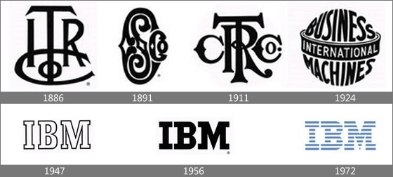
When it comes to IBM brand icon we can see from the above evolutionary phase they have always focused on Typography .In 1947, when IBM changed from punched-card tabulating to computers they changed their logo to a simple font to reflect their move but they still had the font, now with solid letters with horizontal stripes to suggest “speed and dynamism.”
5. Peugeot
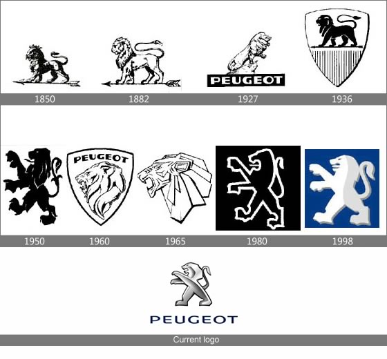
The Lion has been the sign of superiority for a century and a half, to Peugeot. Over the decades, the lion has been the link between the products, which have been as countless as they are incredibly diverse: from hand tools to automobiles.
The lion was designed in 1847 by Justin Blazer, an engraver from Montbeliard, and registered in 1858 at the Conservatoire Imperial des Arts et Metiers as the lion, reflectes power and strength. It is used till date but with a little change in 2010 with the Lion on the radiator grille: is simpler in its design, more dynamic, with a new posture and a new variability, creates a bimetallic effect through the contrast of its mat/lustrous finish.
7. Volkswagen
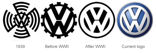
Can you believe it this renowned brand logo was designed during an office logo design competition by Franz Xavier Reimspiess. The main part of the logo hasn’t changed much, but after the WWII, justifiably they got rid of the design around the circle which was from the Nazi flag. The logo which was built after WWII with the color enhancement, it portrays a positive change in the company and the ability to adapt to the new millennium.
8. NIKE
In 1971 Carolyn Davidson created the true and only ‘Swoosh’ logo for NIKE which represented the wing of the Greek Goddess ‘Nike’. With time and the popularity of the brand the logo was simplified as they realized the name wasn’t necessary anymore the simple ‘Swoosh’ connects us to NIKE everywhere now.
9. Pepsi
10. Envato
11. Mastercard
12. Nokia
13. Google
15. Firefox
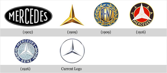
16. Mercedes Benz
17. Alfa Romeo
Start your brand with logo design and get some design inspiration here.

